Computers
for Architectural Graphics
by James J. Lemon
email: lemonjim@pacbell.net
home page: http://www.jjlg.com
I was overjoyed and honored to get the opportunity to write a short article about the artwork I have been making. Recently I have been trying to explore the capabilities of Corel's Bryce 5 (tm). Although this experimentation has produced a variety of different styles on varied subject matter, some of the higher rated and most commented ones seem to involve images of fantastic or more real architecture.
The Motivation
It seems
to me, I have always been interested in architecture and rendering. I can't
remember not being fascinated with buildings, bridges and such.
The Tools
Some of the
tools are obvious: A Mac G4 867MHz. PhotoShop, and Bryce for starters. A
digital camera, the Nikon CoolPix 995 seems more than adequate. A scanner,
new this year, the Epson 2450. An Epson 1280 13"x19" printer makes
exquisite output. Sometimes the use of Corel's Painter 7 is a nice addition,
but this tends to overlap with PhotoShop. Illustrator is nice but not really
required for most of this work. There's more but I'm guessing this setup
could be amassed for around $5000. Also, most of these techniques would
be similar in almost any low-cost 3D programs. If you are new, I heartily
recommend Bryce, it has a shallow learning curve - I was using it right
away - but the curve seems to have no upper bound. It is going on about
10 years now, and I'm just getting good, and realize it may be another 10
to exhaust the options. By then I'm sure there will be many more options!
The Techniques
 Technique Zero: Composition
The eye of
a Western person (accustomed to reading left-to-right) will in a general
way, meander from top left to bottom right, or so the theory goes. Somewhere
along the way, I want to make the eye pause and hover. That's it! The eye
wants "excitement" which can be found in several ways, such as
movement, volumetric shape, contrast, detail
or the lack of it. I try to exploit as many of these as possible, make you
feel that you can step right into the space I've created for you, and to
feel somehow comfortable in there. All to make the original point, a believably
ornate entrance gate.
These attributes
are like the notes on some 3D organ that can create smooth or cacaphonous
notes, depending on the score. There's a place for the contrabassoon and
for the violin. One of my earlier models used a distorted lens and much
like an M. C. Escher lithograph, was successful in providing the "notes"
mentioned, but when you stepped back you saw a larger fallacy. Nevertheless
the rules aren't violated by Escher, you can feel comfortable in parts of
the image, but the higher brain rejects the idea or seems befuddled, and
to me, this makes M. C. Escher's work shine. Even if the image is itself
new or old, from any culture, the playing of these graphic notes can be
used to roughly grade graphic "music" into classes and subclasses.
The final grade is achieved with successful application of the test, "Does
it do what it purports to do?".
There are
many possible means to these ends, and I have by no means exhausted even
the short list. How do you get started? Usually I try to "call the
shot", by which I mean that I try to envision a result or sub-result
as completely as possible, then go try to make it. Following are several
more detailed examinations of solutions I have found.
Techniques 1: Making a Wrought-Iron gate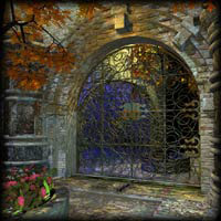
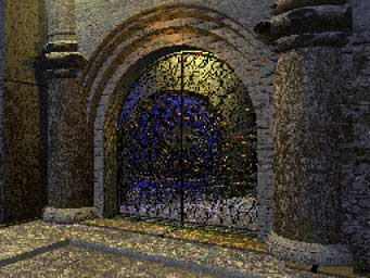
I wanted
to make a nice entryway, the kind you see in older urban areas such as in
Europe. But first I would need the gate. It would be the "Hero Object"
of the scene. I wanted a kind of wrought-iron gate, like you might see at
an entrance. I had a rough idea of a composition to focus attention on the
gate, give it scale, make it contrast and to provide a "mark"
against a receding "field", and make it appear as real as possible.
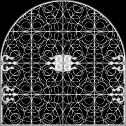
Part 1: The GateThere would
have been many ways to make one, but I chose the "symmetrical lattice"
object in Bryce. These have the property of being a symmetrical height-field,
where we can control a height grid by painting a gray scale image. Where
we paint white or lighter colors, the surface bulges up, and black or darker
bulges it down. In photoshop I made anew 512x512 square gray scale image,
filled with a black background. In pure white I made a pattern of circles
so that they nested together the way I wanted. Defining this as a "custom
pattern", it then filled a 1024x1024 document and thus repeated four
times. I flipped the quadrants until they were symmetrical, then cut away
(or painted with black) to round off the top. Then, in levels of gray, I
made some details such as the plates where the hinges and doorhandles would
later attach. This was saved as the "Ornate Gate" height map.
For all of this I could have used the unsymmetrical height field, but the
symmetrical choice allowed me to ignore worries about the camera being in
front of or behind the gate. I could also have built it up from primitives
like tori and square bars, but that would be tedious and the file would
be huge and unwieldy - don't go there - from experience, believe me.
 |
|
Ornate gate pattern
|
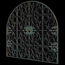
In Bryce
I made a lattice object and mapped the image onto it, assigned a metallic
texture, and the gate itself was ready. But it still was just a gate, floating
in space. Time to start building!
 |
 |
|
Ornate gate symmetrical lattice
|
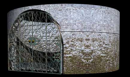
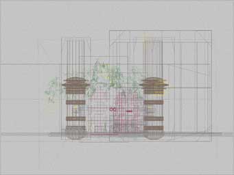
Gate in a round building
|
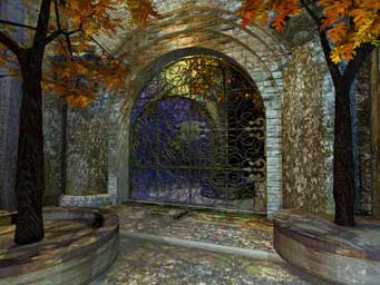
Part 2: The Surrounding EnvironmentConstruction
of the rest of the building around the gate was done mainly with simple
geometric primitives, some in boolean combinations such as openings for
windows and doors. and some nice textures I obtained from the excellent
www.animax.it collection. Bryce trees were thrown in and adjusted, and then
finally the last adjustments to lighting and final camera tweaking before
the final rendering. Most of the lighting and camera placement is done during
the construction as many test renders are required after major additions
or revisions to the geometry.
 |
 |
|
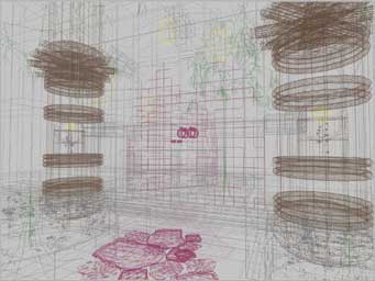
Intermediate render
|
Intermediate render
|
It's often
after the first larger render is going, that I come back and check to see
how it looks. Sometimes there's the horrible discovery that something's
amiss, such as a beam that awkwardly protrudes through a brick wall or some
such problem becomes evident. Usually I halt the render, fix the problem
and then start over. Sometimes (ha!) it's weeks later and there it is, some
subtle but egregious error. That's why an important part of the technique
is profligate use of CDROM backups with all of the intermediate files and
such saved intact. These often come in handy much later, for
example, the gate itself is a piece I have re-used.
Part 3: WrapUp the Render! 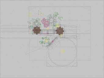 |
 |
|
Top
|
Side
|
 |
 |
|
Front
|
Camera
|
 |
|
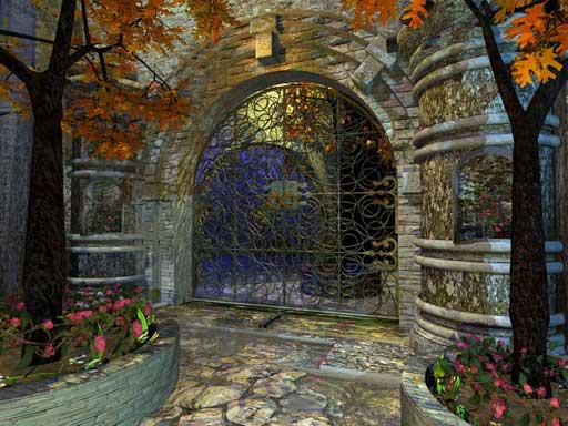
Final render
|
Now you can
see that none of this is particularly difficult, but it helps to have a
clear goal, break the problem down and apply the right tool to the job.
As I look at this image today, I feel it was successful in establishing
the intended mood, largely because of the placement and color of the lights,
and how they interact with the textures. The top view shows that it's like
the Hollywood stage set, there's nothing behind the walls you can see. Note
the subtle dappled texture from light going through the trees. There are
invisible light sources throughout, for example a yellowish one right above
the gate, and the bluish one just on the other side lighting up the inside
of the round turret. I was blind to the unsightly "waistline"
in the Bryce trees and didn't notice until someone pointed it out, now I
can't look without seeing it. I would have pushed the trees down some more,
but it was too late, I had already started the next model!